Paperlike
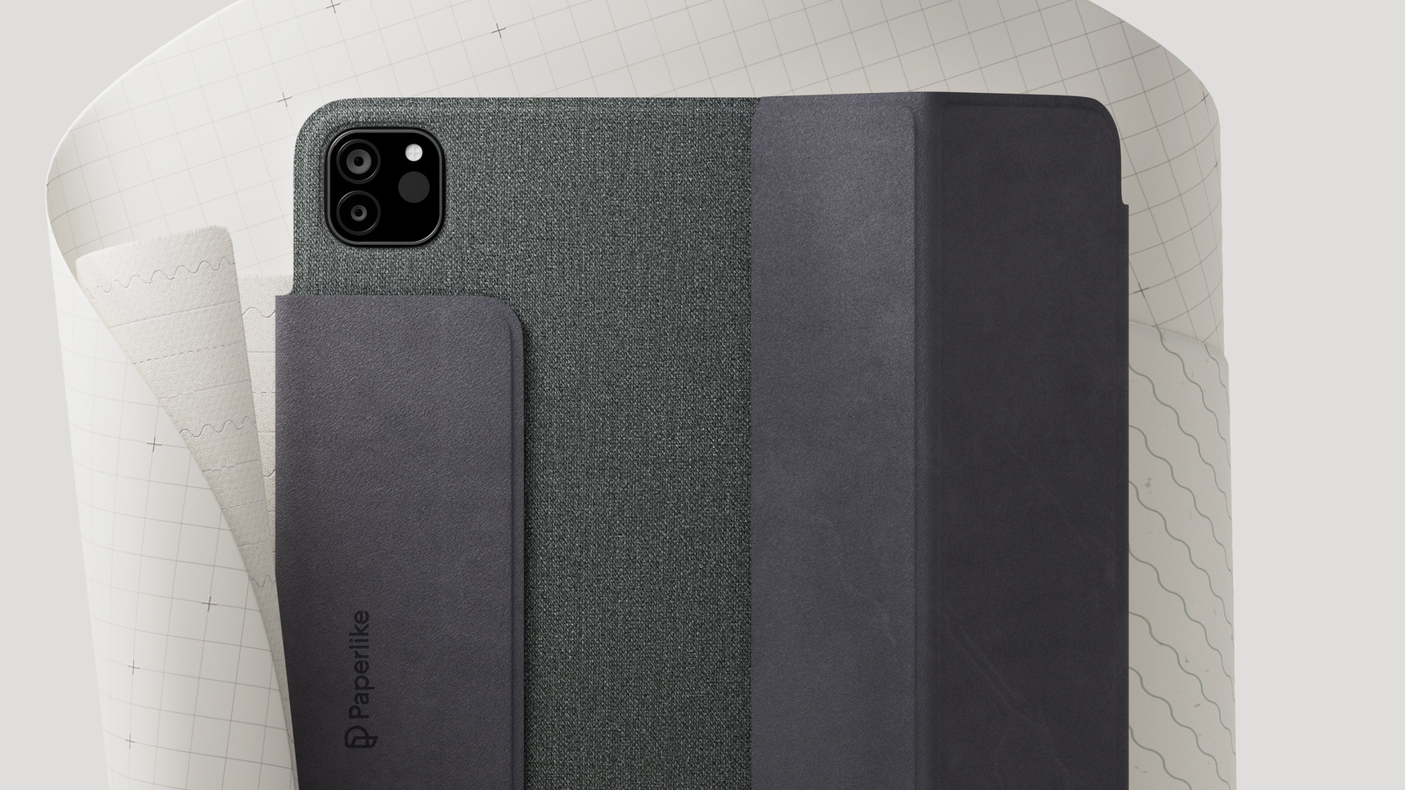
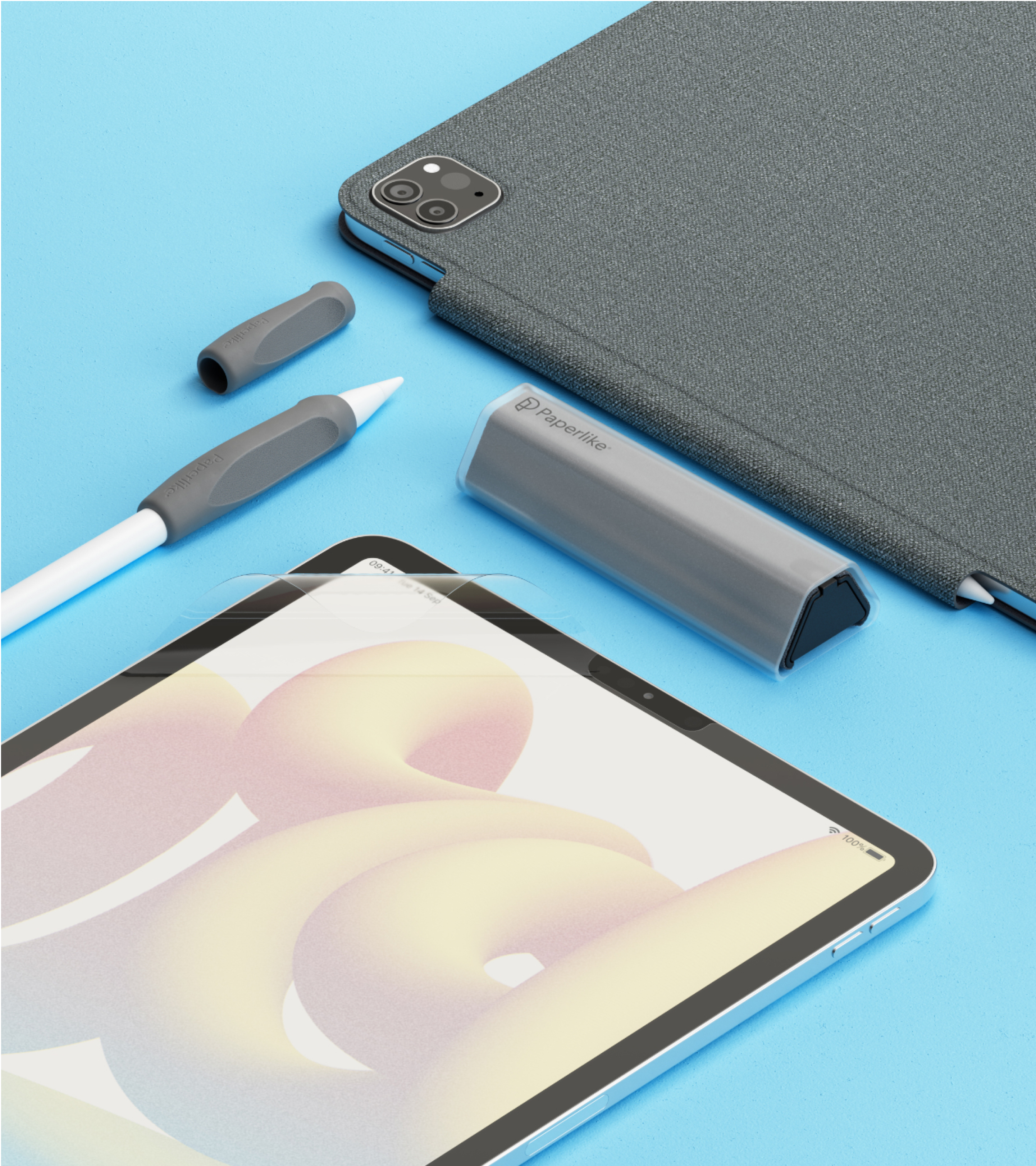
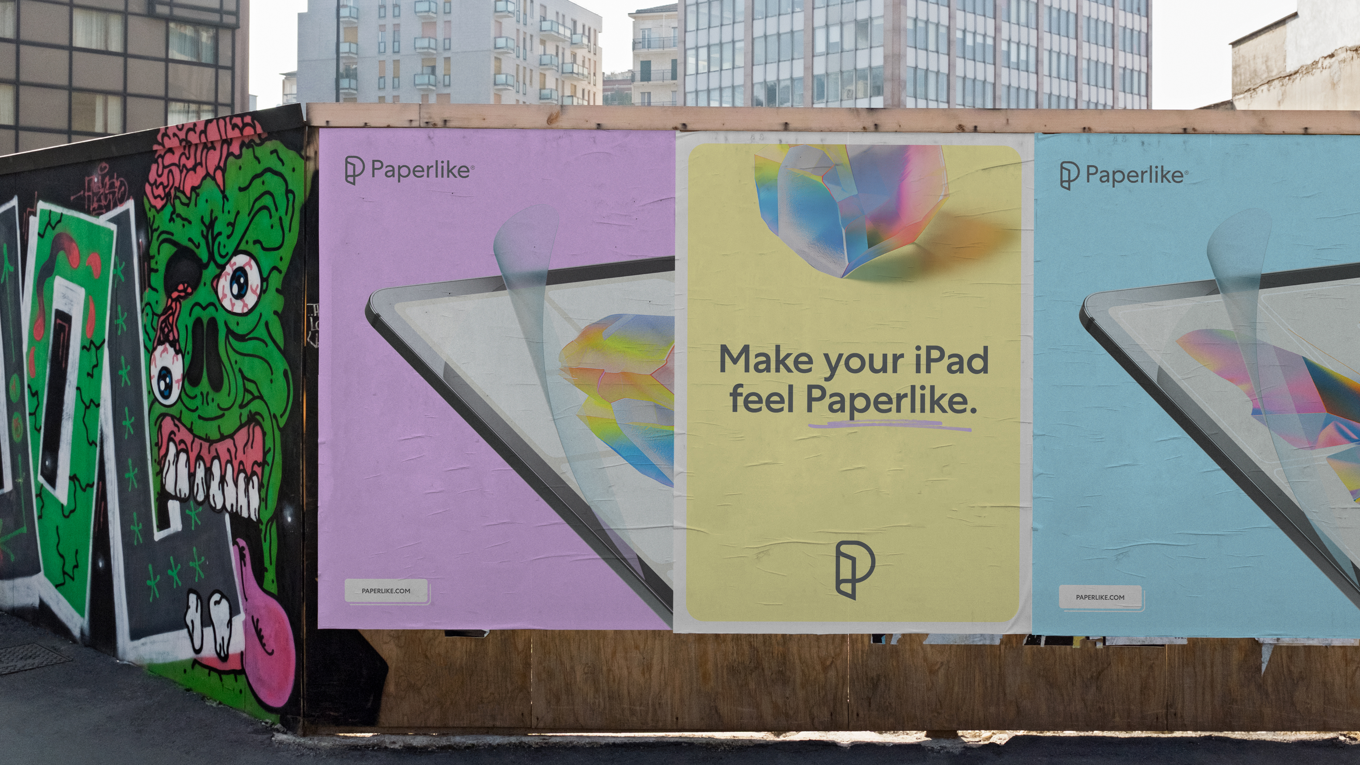
Make your iPad feel Paperlike
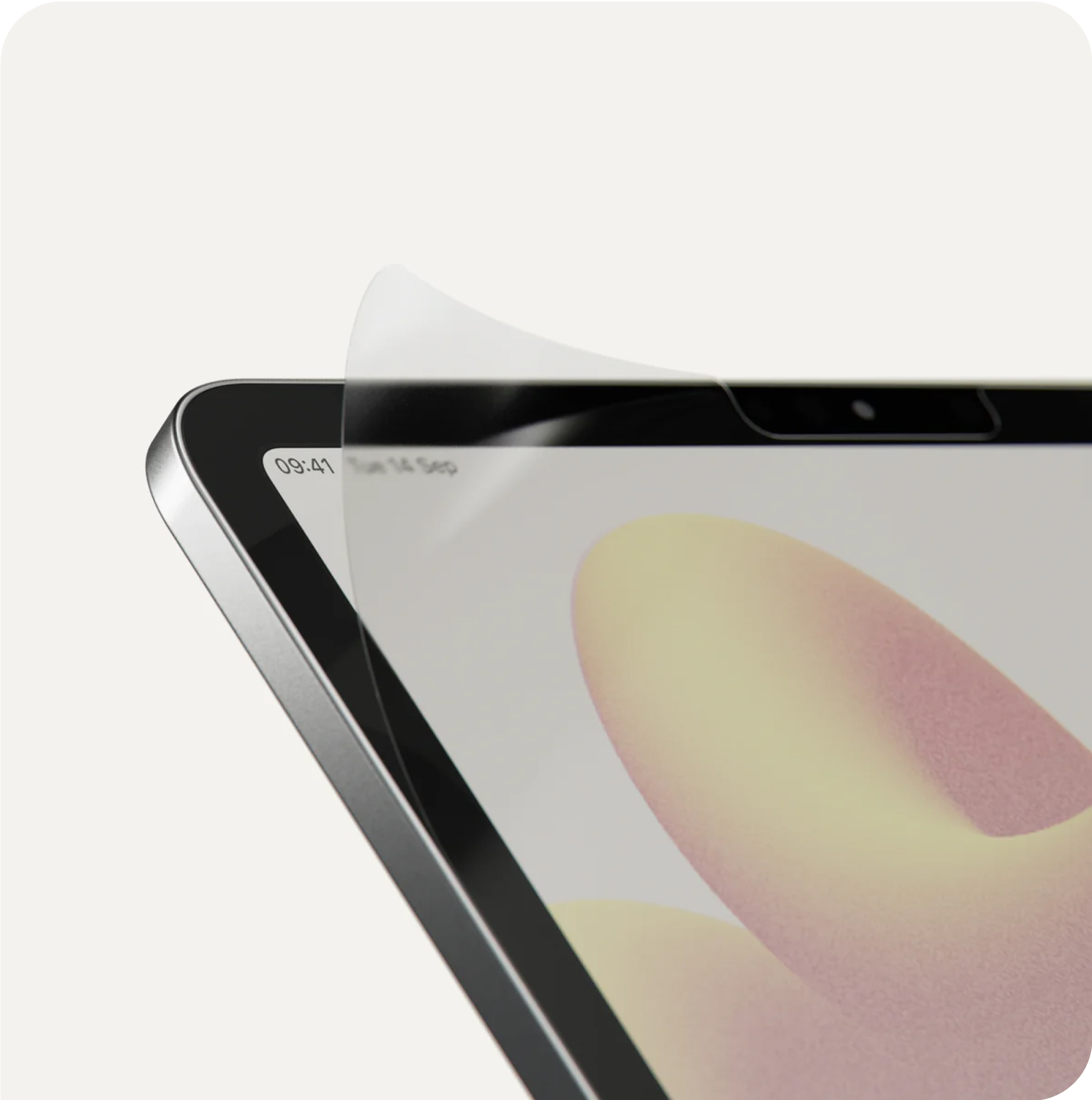
Building the brand of the number one iPad screen protector company, from launching on Kickstarter to becoming a company retailed across the world, with millions of happy customers.
Illustration: Nata Schepy and me
3D: Vitaly Grossmann
Digital design: myself and Magnus Dinesen
Paperlike team: Sebastian, Joss, Deniz, Jan, Lukas, thank you for being awesome to work with
Illustration: Nata Schepy and me
3D: Vitaly Grossmann
Digital design: myself and Magnus Dinesen
Paperlike team: Sebastian, Joss, Deniz, Jan, Lukas, thank you for being awesome to work with